Your brand color palette sends a powerful message about your company. Use a few simple techniques to unleash its power to engage and intrigue trade show visitors.
Our perceptions of color are often culturally determined but also harken back to an elemental response, which a strong brand palette uses to its advantage. Your brand may emphasize red or orange to evoke fire and the heat of the sun; green to suggest growth and the calming effect of nature; blue for a sense of trustworthiness and stability, but also the fluid energy of water. Neutrals—black, white, beige—anchoring your palette can make a big impact as well, conveying a sense of sophistication. When you also factor in hue, saturation, and luminescence, your color choices brings your brand to life.
The Brand Color Palette
For exhibit spaces, it’s the trade show designer’s job to take your brand palette and apply it to your booth architecture in new and arresting ways.
Jonathan Hackler, Apple Rock’s Vice President of Creative who has been designing exhibit spaces for 16 years, says, “Clients look to an exhibit designer to connect with new trends and use their brand palette in unexpected ways to stand out from the crowd.”
“Different clients have different ways they want to engage with their target market. To take two extremes, at a fitness show, clients may have a bright neon brand color to make a bold, impactful statement—they want to use it all over the booth giving the space the attention and high-energy environment which aligns with their brand. At a healthcare convention, on the other hand, clients want the use of color to be subtle; they want informational graphics and other booth materials to speak for themselves. The booth style tends to be more toned-down, and calming, by using more neutrals while being very selective with their brand color placement.”
Effective use of Brand Color Schemes
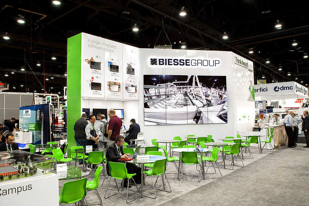
The impact of bold color is obvious in Biesse Group’s exhibit space. Biesse, an Italian-based international producer of machining systems, relies on a monochromatic palette of white, black, and grays with bright Kelly green used sparingly as an accent. By applying the green on the modernistic chairs against a white backdrop, the designer created a feeling of energy and a focal point that served as a visual draw for attendees of the show, while at the same time staying true to the brand palette.
Working with color is all about balance, Hackler says. “When we use solid color in the exhibit space, we play it off imagery and promotional materials, as well as texture, tactile qualities, and lighting. Color directs your eye by providing a strong contrast or an element of surprise.”
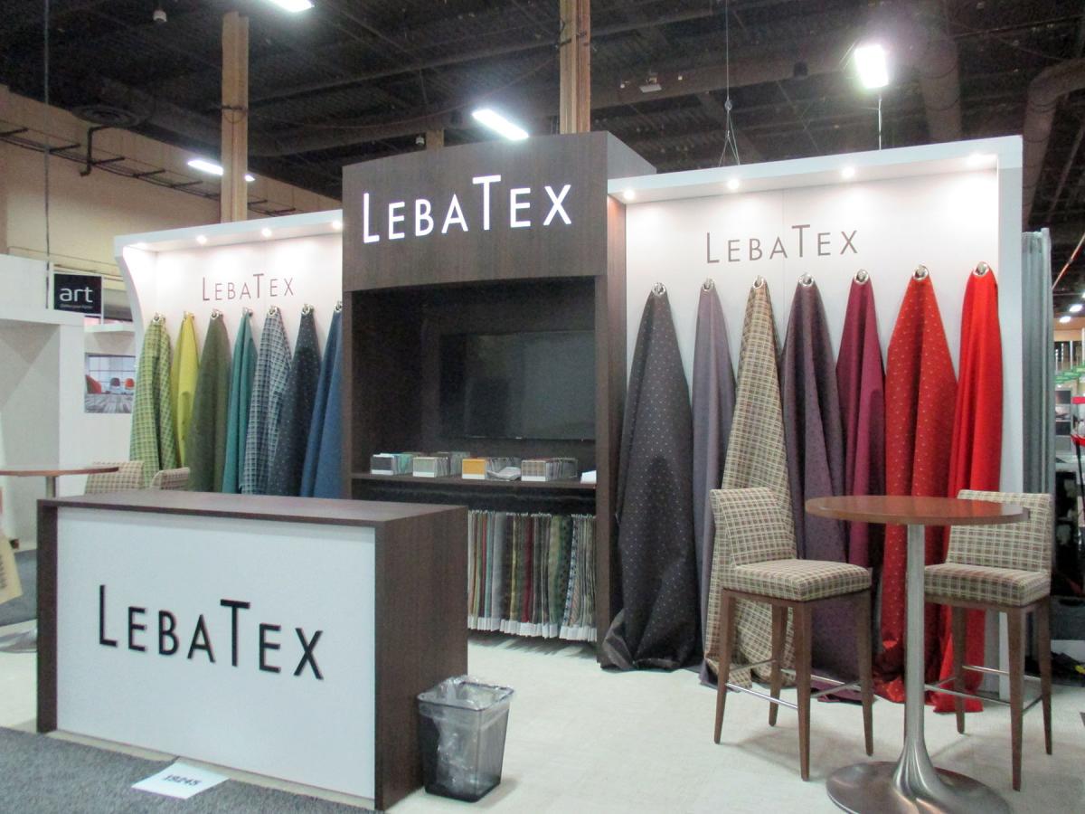
For New York–based Lebatex, the company’s product—high-performance fabrics for the hospitality industry—is the color element in an otherwise neutral space. The rainbow array of draped colored fabrics, with varying textures and patterns, is eye-popping against the strong symmetry of the booth structure, inviting visitors to touch and focus on the product itself.
Your brand palette doesn’t have to be confining. The interactive nature of your exhibit space offers limitless opportunities to highlight your product and engage visitors.
Color Resources
Here are some good resources on how we interact with color: