A Gray Area
Ready for a much needed conversation. A topic that most think is very straight forward, but actually has quite a few variables to achieve the best outcome. Let’s talk COLOR in the large format graphic printing process.
 Color
Color
Most think color control and matching is a given with their graphics and there isn’t much to it. The truth is there are MANY factors that enable good, consistent color output. Let’s begin with the topic of matching first.
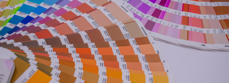
If you are familiar at all with the graphic design/printing process, then odds are you’re familiar with this thing called the “Pantone Matching System”, commonly known as PMS. The reason for the PMS system is to help brand and/or specific spot colors to remain true, even when printed at different locations. Most clients have PMS colors assigned to their branding. Since the PMS color system is commonly used across the entire print industry, having a PMS assigned to brand colors gives printers a universal target when prints come off the press. Printers can compare the printed colors to the PMS swatch book to see how close the prints are to the PMS target color(s). Even though we don’t hand-mix ink, as is done with traditional offset printing, today’s advanced large-format inkjet printers have extended color range and can still hit the majority of PMS colors needed.
For color matching from inkjet print systems Pantone specifically created what’s called the “PMS Bridge Book”. This PMS Bridge Book shows the traditional PMS color swatches and directly beside them another swatch which represents the closest a CMYK print can get to that PMS color. Let’s say your PMS color is 485. Pantone says the inkjet build in your print file will be made up of C=0, M=81, Y=86, K=0 in order to achieve the closest printed color possible to that PMS 485 target. Referring to the PMS Bridge Book is invaluable when setting realistic print expectations in regards to final, printed brand colors from inkjet printers with the 4 standard printing colors, Cyan, Magenta, Yellow & Black (CMYK). Today these printers do come with multiple CMYK cartridges to expand their color range greatly. Printers today may have 8 or more color cartridges to achieve that extended color range which helps to match specific PMS (Spot) colors even better.
It is also important to remember that all graphic files and images should never be created or saved in RGB (Red, Blue, Green) mode. To achieve optimal color expectations, all images, graphic files and spot colors should be set up using a CMYK profile. Why? Because RGB is a light-based color range, while CMKY is a print-based color range. The RGB color range is MUCH larger than what is actually printable, so using the CMYK mode sets up realistic printing expectations. Also, if color matching to your brand is extremely important, then always make sure you request a Hard Copy proof before your job is printed.
A Hard Copy proof allows you to see certain areas of your graphics and/or specific colors printed on the exact material your final product will be printed on, thus ensuring the quality of your colors.
Substrate
At Apple Rock, we print on everything from paper, to fabric, to vinyl, acrylic, glass, wood, and that list could go on with our direct flatbed printer. Most printers use translucent inks for the additive printing process to achieve that great range of colors. Translucent ink means the substrate can greatly influence the colors being laid down. Most of us know, even with standard white, there are going to be variations in substrate color which will then influence the print output.
Not only will the material color affect the print, but also the texture of the substrate. Subtle differences in the surface, such as how smooth it is, will affect how the color lays. A highly smooth surface is what creates glossy prints while more coarse surfaces are what create a matte print. Smooth, glossy surfaces keep the ink on the top more (called holdout), while matte surfaces tend to absorb the ink. You can even have the white point of the same material shift from roll to roll due to a change in the manufacturing of the material. Remember that comment on absorption? We will revisit it later. In regards to texture, it also affects how the light bounces off the surface and is reflected back to your eye. I’ve seen prints laying on a table with dead on color experience a distinct shift when it’s simply lifted up vertically due to the light hitting at a different angle.
Lighting
While the implementation of LED lighting technology is one of the greatest things EVER in the exhibiting world due to it being very resilient, versatile and affordable, it still comes with the same variable that affects color just as much as non-LED lighting did. Color Temperature. Most of us know the temperature of any light source from cool to warm can change the color of anything it shines on. I’ll bet you’ve even had the experience of putting a different temperature bulb in a lamp in your home and noticed it changed the tone of, literally, everything in the room.
WELL THIS HAPPENS WITH PRINTED GRAPHICS IN THE EXACT SAME WAY.
Add the use of back-lighting and that temperature factor can become a VERY big deal with how it impacts the color perception of the graphic in front of it. Pair that with the varying substrate tones and light-box graphics have a double-whammy with color control and accuracy.
I WON’T EVEN GET INTO THE SUBJECTIVITY OF A COLOR BEING CORRECT WHEN IT’S GLOWING.
One thing somewhat out of our control is the overhead lighting being used at the location of set up or installation. We can only hope color friendly lighting is being used in show halls and event centers, but the truth is, we’re never sure. Sometimes colors can come out perfect in our color-controlled facility, but then experience a shift at the install site due to a difference in overhead lighting.
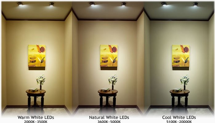
FOR THE RECORD, 5000K LIGHTING TEMPERATURE, WHICH SIMULATES DAYLIGHT, IS MOST WIDELY USED FOR COLOR CORRECT VIEWING.
Another thing that goes hand in hand with lighting is computer monitor color and calibration. Most monitors being used by the average client are not calibrated for color. This can cause some issues when approving colors via electronic proofs since we never know the monitor quality any given client is viewing our proofs on. Today people even view and approve proofs on their phones.
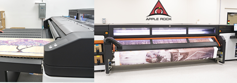
Printer
The tools we use, no matter what the craft is, can make an impact on the results. The same with printing. Each printer is unique and it can take time to truly understand the nuances each one has that affects the print results. One feature common with commercial inkjet printers today is the addition of additional inks to help extend the color range the printers have. Printers may now come with 8+ ink cartridges to achieve this greater range.
Now this still isn’t equivalent to the custom mixed inks of the Pantone system, but it does help printers come closer when color matching is needed. Today’s large format printers tend to come with good calibration and monitoring software built in to help preempt or diagnose any problems or malfunctions which may occur.
Calibration
Just as with any tool or anything mechanical, the more it’s used the more it will require maintenance to keep it “sharp”. Just as it’s normal to change the oil and rotate the tires of your car, printers are the same. They need regular maintenance and calibration to ensure their consistency with quality graphics. These printers have a lot of moving parts and circulation so there are a lot of areas which can slowly “drift” during heavy use. Regular calibration helps pull things back into alignment if they have slightly walked out due to use.
G7 Certification
I could easily go on, but this touches most of the main factors which impact good printing and color control. Most reputable print houses have strict standards and practices implemented to maintain and monitor the variables discussed above.
There are also programs such as GRACol & G7 Certifications for implementing good S&P’s in print environments to maintain color control in the professional print industry. Printers with these certifications have been evaluated by an outside organization and confirmed to meet their color control standards. I’m proud to say that Apple Rock has achieved it’s G7 Master Certification for the quality we uphold with our printing processes.
Thank you again for your time, and I hope this has helped broaden your understanding of the printing process and challenges that come along with it. I also hope it adds value to what we, at Apple Rock, do for you to help produce some of the best graphics in the industry.
Creatively,
Jonathan Hackler
PS - FUN FACT: Did you know the color you see an object “as is” actually the color it’s REJECTING? Seeing a Red apple means the apple is absorbing everything but Red. We say the apple is Red, but in actuality the apple is bouncing the Red back to your eye while absorbing the others. So is the apple actually Red?