Do your color homework and make your interactions with your exhibit designer produce the results you want!
Talk to your Exhibit Designer about Color
Color management involves a lot of factors—brand palette, lighting, substrate materials, and graphics. A skilled exhibit designer can balance all the color elements to create a compelling, coherent booth. But you have a role, too: The more you understand about the process, the better the outcome will match your vision you have for promoting your company and products.
Color Matching Standards
First off, know your color standards. Most ink-jet printers, from the one on your office to high-end printing presses, use CMYK inks, and there is considerable variation based on how each printer is calibrated. CMYK is the abbreviation for Cyan (blue), Magenta (red), Yellow, and K/Black (so-named because the other color plates are keyed to the black plate).
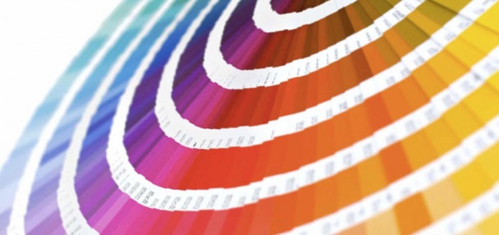
Pantone is an internationally recognized color standard system that guarantees color accuracy. Your designer will compare your color samples from your brand palette or other sources with the output using Pantone.
Idealliance’s G7 is a standardization system for color printers that guarantees the highest color accuracy. Companies are awarded G7 Master Qualification for their ability to operate G7 systems effectively.
Material and Ink’s Effect on Color
Ink (color) + substrate (paper or fabric) = graphic image. That much is pretty simple. But how ink reacts to the substrate will alter how the image appears. On glossy or coated materials, ink tends to sit on top of the surface, while on uncoated or matte materials, ink is absorbed into the substrate. Pantone addresses these differences with color books for coated and uncoated papers.
Each color ink, C, M, Y, or K—can have different absorption rates even on the same substrate. To control for these variances, the final color output needs to be checked against Pantone cards for the appropriate substrate.
Lamination, used for detachable and rollable graphics to keep them durable and long-lasting, introduces another variable. However, the type and thickness of the laminate can affect the color of the printed graphic it is applied to. To compensate for this, the printer can be calibrated to factor in the color or tint of the laminate.
Light Temperature and Color
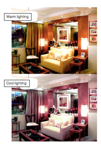
Light temperature changes our perception of a color palette dramatically. Most print shops try to view color under lighting in the 5000 range on the Kelvin (K) scale, which is the equivalent to sunlight or outdoor light. Lower (<4000K) ratings appear warm or reddish, while higher ratings (>7000K) appear more blue, with the range in perception seen in the photo. A recent trend is to use newer LED lights in a 4000K range.
Most venues provide show lighting in a neutral range and will direct spots if requested. For maximum dramatic effect, though, invest in in-booth lighting. Custom lighting highlights brand elements and products and gives you control over lighting temperature, ensuring that your brand appears in its true colors. You can also use custom lighting to direct the visitors’ focus where you want it.
Planning for Trade Show Color Consistency
According to Jonathan Hackler, Apple Rock’s Vice President for Creative, time is a key factor in color management.
“The greatest source of disappointment in color displays is due to rushing the production process without enough time for color correction and production proofs,” Jonathan says. “It’s also important to color-match all materials used within an exhibit. Light reacts to different surfaces and at different angles, which can cause a shift in color perception.”
Here’s a checklist to ensure your color experience is a glowing success:
- Your exhibit designer will give you a schedule. Make sure you are available to respond to each step in the production process.
- Supply your brand standards (logo guidelines, colors, fonts).
- Provide color-critical elements as Pantone colors, not CMYK.
- Provide in-hand samples of anything the designer needs to match—fabric, posters, brand colors. Pictures on computer monitors are not accurate enough to use.
Your booth’s graphics and color elements put your company in the spotlight—literally. Now that you’re a color maven, use these steps to work closely with your color designer, and keep the drama in your exhibit space, not in the print room.