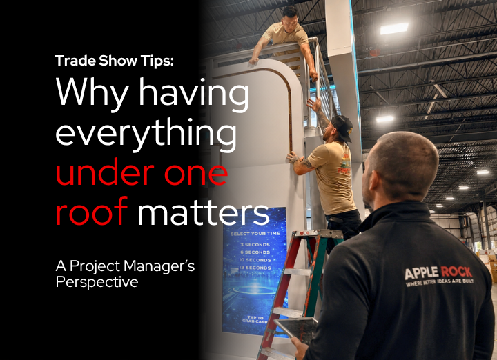
Color Challenges and Solutions: A Q&A with Trade-Show Designer Jonathan Hackler
Change and high energy define the trade show world. Clients want to be on-trend without losing their brand identity in the shuffle. Sometimes, though, clients used to working in the two-dimensional world of advertising and social media have a hard time articulating what they want. Jonathan Hackler, Apple Rock’s VP for Creative, brings exhibit booths to life by balancing color with other considerations. In this interview he shares some examples of how he addressing each client’s unique design challenges.
Q: What are the typical uses of color you are seeing in today’s exhibits?
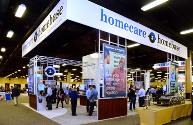
A: Most exhibitors today are dialing back their branded graphic elements in favor of experiential spaces. Structural elements such as aluminum extrusion trusses can create a dramatic setting. There is also more emphasis on natural elements such as wood or stone (often created from high-end synthetics for cost and ease of transport) to create a feeling of depth and texture. Neutral colors are used as a backdrop to the brand palette. Large-format imagery or photography draws the eye and fills out the space, but it doesn’t dominate. Brand colors and graphics of course play a role, but it’s used subtly. The experience of the space becomes the message, rather than visually heavy graphics.
Q: Visualizing how color and lighting will work together in an exhibit space isn’t easy! How do you help clients communicate about the changes they would like to see in an exhibit design or update?
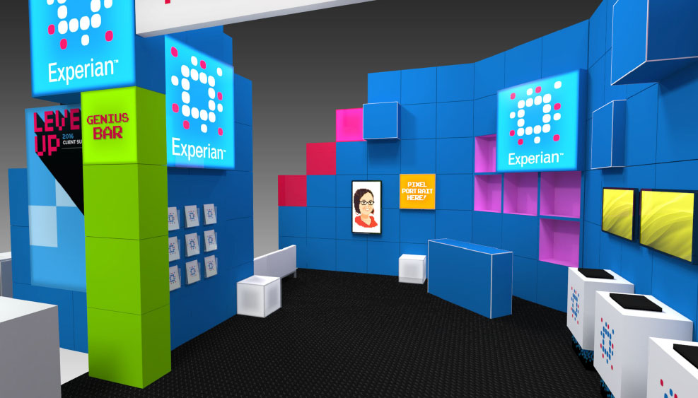
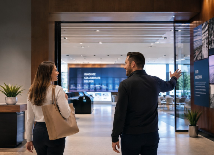
A: Even for the most marketing-savvy folks, working in three dimensions is a big change from the two-dimensional world of advertising, web design, and social media. We start with a conversation about what type of impact they want to make—adventurous and bold, or authoritative and subtle. Either direction is valid, depending on their marketing strategy and the show environment. To get across how color, lighting, and other factors will work together, I draw up a 3-D rendering, which becomes the basis of our conversation.
The forward direction of a client’s “change” is also highly dependent on their current marketing or exhibit strategy. What’s the message they want to get across?
Q: If a client were to say, “We have a limited budget and can only change one aspect of our display,” what would you recommend?
A: One of the most overlooked elements of an exhibit space is under our feet.
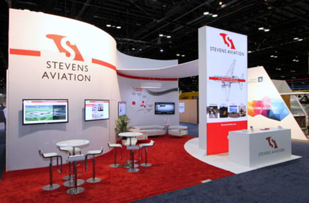
Clients are often reluctant to invest in flooring, but during the design phase I stress how the effective use of carpet or laminates can make a big impact on an exhibit space. Adding a bright color underfoot can be a huge eye-catching element. In the example, carpet-cuts and inlays guide traffic into and through your exhibit space, or they can divide it up as needed.
Q. You discussed how neutrals are trending these days. Can you describe a situation where a “less is more” approach was used to create an attractive, professional exhibit space?
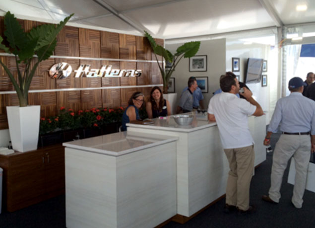
A: Hatteras, which builds and sells high-end yachts, is a great example of less-is-more. To appeal to the company’s select clientele, they chose an understated approach. In place of large graphics and heavy use of branding, they filled the exhibit space with neutral-colored materials that recall their luxurious vessels, such as teak paneling and sleek fiberglass. The diaphanous fabric that hangs from the entrance to the exhibit space also suggests ocean breezes. The result is an effortless yet elegant space in which their discriminating and sophisticated clients can explore new features and “talk ship.”
Q. How would you describe the role of color trends?
A. Trends change mainly because we, as viewers, always want to see something “new.” Visitors are attracted to what they haven’t seen before. Especially in today’s fast-paced world of bigger, better, newer, it’s important to always maintain a fresh, interesting visual appeal to viewers.
Most of the companies we work with understand trends in color as they impact their brand identity. And many of our clients have up-to-date exhibits, but still need a change to attract attention. If I know what is happening across the industry, I can guide our client’s exhibit review and update. The goal, of course, is a space that uniquely positions the client’s product or service: on-trend but not cookie-cutter.